


One of the ways we, as pastelists or any artists producing works on paper, can make our artwork more desireable to collectors is to consider the issue of reflection. It is a hard reality of our passion that the pastel medium we love requires us to cover our paintings with a transparent substance in order to preserve and present them. Regular glass does our paintings no favor. If there is a light source you are often unable to see the art underneath. And I am surprised at the number of artists, collectors, and even galleries that think non-glare glass with it's milky, blurring characteristics shows our artwork at it's best.
The best way to frame our artwork is with a glass that reflects the least amount of glare but preserves the clarity of our images. That relegates us to spending extra money on AR (Anti-Reflective) glass or the gold standard, Museum glass. Thankfully, these surfaces also lend the added benefit of UV protection which will increase the lightfastness of our images.
Now the reason for this posting. Turns out AR and Museum glass, despite their ability to show our art at it's best, are very difficult to keep clean. Water spots it, and every fingerprint leaves it's mark. Then if you go near it with Windex and you are doomed. You will think you have ruined the glass - the streaks you create will not go away!
There is a very simple solution to keeping the glass clean. Remember this: Simply make a mixture of 1/2 plain water and 1/2 alcohol. Spray onto a clean cloth (microfiber is best) and wipe the glass until all the fingerprints. smears, and spots disappear. It's actually easy, and just costs pennies. Be sure and let your collectors know this is how to keep the glass clean - either include the instructions ina thank you note following the purchase, or write it out and tape to the back of the painting.
Sunday, May 9, 2010
Thursday, October 22, 2009
More on Signing Your Artwork...
 This may seem simple but be sure to sign your artwork - redundantly. Sign your painting on both the front, AND the back. And on the back please write the name of your painting. And this is why...
I just finished hanging a show. As we went to label the show we ran into an issue. An artist had two paintings accepted into the show but we couldn't figure out which piece was which so we couldn't place the labels. The titles of the works didn't give us a clue and there was no writing on the back of the paintings. The problem was that one piece was for sale and the other was NFS. We wound up making a guess based upon the titles but hope we haven't made a mistake in case the wrong one sells! This may seem like a small detail, but to folks hanging a show it can become a problem and the issue could get lost in the confusion of prepping for an opening. And it can certainly be a problem for an artist who winds up selling a painting they labeled NFS! Human error happens so you do what is commonly called redundancy - you provide important information not just once - on your paperwork - but again - on the back of your artwork.
Bottom line is the suggestion that you be considerate to those who will be handling your work out of your presence. Paperwork WILL get separated from your artwork. People cannot guess that this painting is "Polly's Pond" and that one is "Pine Pond Impressions". And if you carry an inventory of work at a gallery people will be moving things around, pulling work out to be shown to clients, etc. You want to easily facilitate this and not cause confusion and extra work for your dealer.
This is what I do. I sign the front of my artwork with my last name. On the back, on the lower left, I place the copyright sign (lower case c inside a circle), the year, my full name, and the initials of my affiliations. In the bottom center I write the name of the painting. I also place the name of the painting on the backside of the artwork before it is framed - in case the painting is separated from the frame, so future owners will know what piece it is.
BTW, don't put a businesscard or your email or any contact info on the back of a painting if you will be taking it to a gallery - the gallery won't want clients to be contacting you directly and will want you to remove it. However, if you are selling your work yourself it is a GREAT idea to put your contact info on the back of each and every piece.
That's it for now....
Monday, October 19, 2009
Traveling Light: Sketchbooking vs. the Whole Shebang
A traveling artist is a work of art unto themselves. Each one individual, unique, imaginative, often unorthodox (you're using that for what?!), and generally overburdened. Efforts to educate students to lighten their load all too often fall on deaf ears as they leave their homes and can't resist bringing along a "few" more colors - just in case.
Last fall I had the opportunity to travel to Juzcar Spain to paint with Maggie Price's workshop. I did a pretty good job reducing my equipment down to a wheeled backpack with the following: a backpack Heilman box with approx. 250 half stick pastels of various manufacture, a photo tripod with quick release clip, two pieces of gatorboard with trimmed sandpaper and glacine sandwiched in-between, my sketchbook and drawing utensils, a Sun-Eden easel and clip-on tray, a bungee cord, and the ubiquitous "extra box of anticipated essential pastels". All fit into the backpack and settled somewhat comfortably on my back when going through the airport, and easily fit into the overhead storage on the airplane.
This combination of equipment was easy to set up and to quickly knockdown if weather turned for the worse. However, I continued to be plagued with the same thoughts that turn us all into packrats - especially when struggling with trying to capture the glowing bounced light on the walls and alleys of one of the regions all white villages. I was convinced that my difficulties had nothing to do with my skills but the lack of proper colors in my travel palette! The highlight of this workshop was the day spent painting at the historic Alhambra complex in Granada. Our hosts at the Hotel Bandolero had gotten us permission to paint on location and we eagerly piled all of our equipment onto the bus and set off. Once on location we were given our passes and set free to paint where we wanted with the only restriction being when to regroup for the trip back to Juzcar. And this is where I would have liked to have done things differently. After guiltily dragging my 30 pound pack over beautifully restored mosaic walkways I set up in what was an artists dream location come true - a real "pinch me, am I really here" location - the Patio de los Arrayanes (Court of the Myrtles). I spent several hours engaged with this historic scene, imagining the centuries of people who had walked along this reflecting pool, until coming up for air I realized I had only seen a fraction of what the Alhambra was all about and I was running out of time.


I kind of panicked, packed up and then proceeded to get lost. Suddenly this thoughtfully prepared backpack of my precious art materials became a 30 lb.rock and chain holding me down. Caught up in the crowds carefully winding their way through meandering hallways and chambers of indescribable beauty I felt time slipping away and was unable to free myself from my burden. Finally I found myself back to our hosts and took precious time to walk all the way (it felt like miles) to the bus to stash my whole shebang.
I grabbed my sketchbook and my favorite slim black Sharpie marker and headed back to the complex. Ah, freedom! With my new setup nestled under my arm and weighing hardly nothing I was able to maneuver the considerable crowds and stop now and then to do a quick sketch, take a snapshot and move on. I was actually able to visit almost the entire exterior network of buildings with the time I had left. I wound up with a treasure trove of little thumbnail drawings. The beauty of this type of observation is that it allows your mind to stop and rest awhile and really see something magnificent, trace it with your pen, feel it's contours and caress it in a manner you can't achieve by stopping and only taking a swift snapshot.

Back at the hotel, as I reviewed my day, I realized I had truly had the best of both worlds. I had a plein air painting of the Patio de los Arrayanes that will always remind me of the uniqueness of that day, and I also was able to freely roam the Alhambra and experience the entirety of this amazing place. I have a frameable painting and a sketchbook page full of impressions still waiting for me to revisit in a more finished painting, or maybe just in my memory.

I wouldn't give up either expression - the more detailed plein air work or the sketchbook, but this experience has given me a new insight into working on location. When given the opportunity to be creating in an exciting venue, one where my attention will wander and I won't be able to fully engage with my subject without being distracted (oh, did I mention the hoards of tourists wanting to take our pictures in the Patio....) I will opt for my sketchbook and the ability to be nimble. If it had been an off season day, or I had chosen a less famous viewpoint I would again bring my plein air gear.
So this brings me back to my initial dilemma. What to pack and how much to bring. My answer is travel lightly but carry a sketchbook, always. And be prepared to change course at a moments notice. Travel lightly, tread lightly, and wield a wicked drawing pencil, my friends!
And I will get another chance to observe and paint the Alhambra. This time I'm bringing my sketchbook out first. I'll leave the backpack in the bus, but it'll be ready to go at a moment's notice. Next Spring 2010 I'll be teaching my own workshop in the same locations in Spain. I'm looking for a handful of artists and their companions to join me. For additional information you can contact me at liz@haywood-sullivan.com
May 15 -25, 2010 Paint Spain in the Spring with Liz Haywood-Sullivan
(www.haywood-sullivan.com)
Also Maggie Price will be returning to Spain in 2010 as well - her workshop will be:
October 1-11, 2010 Spain Workshop with Maggie Price (www.maggiepriceart.com)
Last fall I had the opportunity to travel to Juzcar Spain to paint with Maggie Price's workshop. I did a pretty good job reducing my equipment down to a wheeled backpack with the following: a backpack Heilman box with approx. 250 half stick pastels of various manufacture, a photo tripod with quick release clip, two pieces of gatorboard with trimmed sandpaper and glacine sandwiched in-between, my sketchbook and drawing utensils, a Sun-Eden easel and clip-on tray, a bungee cord, and the ubiquitous "extra box of anticipated essential pastels". All fit into the backpack and settled somewhat comfortably on my back when going through the airport, and easily fit into the overhead storage on the airplane.
This combination of equipment was easy to set up and to quickly knockdown if weather turned for the worse. However, I continued to be plagued with the same thoughts that turn us all into packrats - especially when struggling with trying to capture the glowing bounced light on the walls and alleys of one of the regions all white villages. I was convinced that my difficulties had nothing to do with my skills but the lack of proper colors in my travel palette!
 The highlight of this workshop was the day spent painting at the historic Alhambra complex in Granada. Our hosts at the Hotel Bandolero had gotten us permission to paint on location and we eagerly piled all of our equipment onto the bus and set off. Once on location we were given our passes and set free to paint where we wanted with the only restriction being when to regroup for the trip back to Juzcar. And this is where I would have liked to have done things differently. After guiltily dragging my 30 pound pack over beautifully restored mosaic walkways I set up in what was an artists dream location come true - a real "pinch me, am I really here" location - the Patio de los Arrayanes (Court of the Myrtles). I spent several hours engaged with this historic scene, imagining the centuries of people who had walked along this reflecting pool, until coming up for air I realized I had only seen a fraction of what the Alhambra was all about and I was running out of time.

I kind of panicked, packed up and then proceeded to get lost. Suddenly this thoughtfully prepared backpack of my precious art materials became a 30 lb.rock and chain holding me down. Caught up in the crowds carefully winding their way through meandering hallways and chambers of indescribable beauty I felt time slipping away and was unable to free myself from my burden. Finally I found myself back to our hosts and took precious time to walk all the way (it felt like miles) to the bus to stash my whole shebang.
I grabbed my sketchbook and my favorite slim black Sharpie marker and headed back to the complex. Ah, freedom! With my new setup nestled under my arm and weighing hardly nothing I was able to maneuver the considerable crowds and stop now and then to do a quick sketch, take a snapshot and move on. I was actually able to visit almost the entire exterior network of buildings with the time I had left. I wound up with a treasure trove of little thumbnail drawings. The beauty of this type of observation is that it allows your mind to stop and rest awhile and really see something magnificent, trace it with your pen, feel it's contours and caress it in a manner you can't achieve by stopping and only taking a swift snapshot.

Back at the hotel, as I reviewed my day, I realized I had truly had the best of both worlds. I had a plein air painting of the Patio de los Arrayanes that will always remind me of the uniqueness of that day, and I also was able to freely roam the Alhambra and experience the entirety of this amazing place. I have a frameable painting and a sketchbook page full of impressions still waiting for me to revisit in a more finished painting, or maybe just in my memory.

I wouldn't give up either expression - the more detailed plein air work or the sketchbook, but this experience has given me a new insight into working on location. When given the opportunity to be creating in an exciting venue, one where my attention will wander and I won't be able to fully engage with my subject without being distracted (oh, did I mention the hoards of tourists wanting to take our pictures in the Patio....) I will opt for my sketchbook and the ability to be nimble. If it had been an off season day, or I had chosen a less famous viewpoint I would again bring my plein air gear.
So this brings me back to my initial dilemma. What to pack and how much to bring. My answer is travel lightly but carry a sketchbook, always. And be prepared to change course at a moments notice. Travel lightly, tread lightly, and wield a wicked drawing pencil, my friends!
And I will get another chance to observe and paint the Alhambra. This time I'm bringing my sketchbook out first. I'll leave the backpack in the bus, but it'll be ready to go at a moment's notice. Next Spring 2010 I'll be teaching my own workshop in the same locations in Spain. I'm looking for a handful of artists and their companions to join me. For additional information you can contact me at liz@haywood-sullivan.com
May 15 -25, 2010 Paint Spain in the Spring with Liz Haywood-Sullivan
(www.haywood-sullivan.com)
Also Maggie Price will be returning to Spain in 2010 as well - her workshop will be:
October 1-11, 2010 Spain Workshop with Maggie Price (www.maggiepriceart.com)
Saturday, October 10, 2009
Observing the Sky
What a treat to spend seven hours with nothing to do but watch the sky. Think about it. Many of those paintings that reside in museums today, that inspire us, and amaze us, were done by painters who did not have the benefit of "reference images". There was no photograph to capture the moment. They relied on their memories, their sketchbooks, and their observations. Were their observations more developed, better than ours, because they knew that was all they had. Are we not SEEING as carefully as we are capable of because we know there is a digital image lurking in our camera?
Saturday was the opening of the Connecticut Pastel Society's annual national show "Renaissance in Pastel". This year it's at the Mattatuck Museum in Waterbury CT and is well worth the visit. The Renaissance Show is one of the highlights of the pastel year, with some of the best pastelists, and best emerging pastelists you will find anywhere. Trust me - see the show if you can. Through October 25.
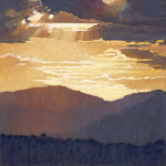
My husband, Michael, drove down and back and all I had to do was to watch the sky. The foliage is somewhat dull this year, probably due to the rainy Spring. But the skies! Have you ever noticed that in the northeast the skies are the most interesting in October and especially November. The steeper angle of the sun causes more dramatic lighting throughout the day. I shot several cloud formations as we drove and here are some of my observations:
• Have you ever noticed that sometimes clouds at the horizon are not only the same blue but the same value as the sky holes higher up, yet you know that you are looking at clouds below and sky above. Weirds me out. How do you paint that!

• The following image illustrates an important concept of painting skies. Regardless of what the clouds look like you need to make sure that the sky underneath the clouds transitions from lighter at the horizon to darker above, gradually, smoothly, and consistently. If it doesn't then your clouds will float in ambiguous space and the impression of distance will be destroyed.
 • Some cloud shapes are not conducive to painting - they look too bizarre, like a broken baguette or hovering spacecraft - however they can be intriguing to look at:


Here's to looking!
Saturday was the opening of the Connecticut Pastel Society's annual national show "Renaissance in Pastel". This year it's at the Mattatuck Museum in Waterbury CT and is well worth the visit. The Renaissance Show is one of the highlights of the pastel year, with some of the best pastelists, and best emerging pastelists you will find anywhere. Trust me - see the show if you can. Through October 25.
My husband, Michael, drove down and back and all I had to do was to watch the sky. The foliage is somewhat dull this year, probably due to the rainy Spring. But the skies! Have you ever noticed that in the northeast the skies are the most interesting in October and especially November. The steeper angle of the sun causes more dramatic lighting throughout the day. I shot several cloud formations as we drove and here are some of my observations:
• Have you ever noticed that sometimes clouds at the horizon are not only the same blue but the same value as the sky holes higher up, yet you know that you are looking at clouds below and sky above. Weirds me out. How do you paint that!

• The following image illustrates an important concept of painting skies. Regardless of what the clouds look like you need to make sure that the sky underneath the clouds transitions from lighter at the horizon to darker above, gradually, smoothly, and consistently. If it doesn't then your clouds will float in ambiguous space and the impression of distance will be destroyed.
 • Some cloud shapes are not conducive to painting - they look too bizarre, like a broken baguette or hovering spacecraft - however they can be intriguing to look at:


Here's to looking!
Friday, October 9, 2009
Followup on CPS Workshops
It's hard to believe that two weeks ago was my day off between the two Connecticut Pastel Society Workshop I conducted in Newtown, CT. I have had a chance to complete two of the demo studies I started on location. The first one is from Ferris Farm. This is a pastel on black Canson Mi-Tientes paper. After returning home I dry mounted the paper on a panel of gatorboard. I usually do the dry mounting before I start a painting but in this case it is none worse for wear when mounted partway through the painting. I have even taken finished paintings back from their owners and dry mounted them when the painting has had issues of buckling in the frame. It is because of this warping, which I cannot predict or prevent, that I mount my paper to gatorboard.

This painting did not require much more work. I needed to straighten out some of the architecture of the red barn and develop the light thrown on the barn side. I added some work to the foreground drive and grassy areas to brighten those areas. Some final marks here and there overall and I am done. I like working this way - starting a piece on location and then doing the finish work in the studio under more controlled conditions.

This next painting, from the top of Holcombe Hill, required a bit more work. This was a piece that benefited greatly from having been started plein air because my reference images failed to capture the subtlely emerging colors on the treeline or the directional light on the treeline. In my reference image everything looked pretty green. Since I was there and capturing the emerging colors in my underpainting I knew that is what I saw.


To bring this painting to finish I started with bringing the right hues and atmosphere to the receding hills in the background. The entire painting needed to be brought up to green. If you get close you will see the purple, yellow, and orange underpainting peeking through. Since the sky was intensely blue above me you will see the relfect of that blue in the shadow areas in the foreground - teal and cobalt blue is lightly scumbled over the dark green and purple shadow. To give you a sense of scale the final painting is 12 x 18 - it is done on a piece of 500 grade UART sandpaper drymounted to gatorboard.

Sunday, October 4, 2009
On Signing Your Art
I have had the privilege over the last few months to work with several knowledgeable and respected judges of fine art competitions. I have also judged myself and am getting ready to judge the Richeson 75. I would like to pass on some thoughts about your painting signature and how you sign your art.
Your signature is generally the last thing you do when you finish a painting and therefore it is as much a representative of you as your painting. A sloppy signature, a boastful signature, a cutesy signature will impart those qualities to your painting - and quite often ruin the appearance of a good painting. A few suggestions:
• Locate your signature in preferrably the bottom right or bottom left corner. Remember to place it so it will not be cut off by a mat or frame.
• Your signature should NOT be the first thing that jumps out at you when you view a work of art. It should never compete with the painting and never be the focal point.
• Be careful about strong color, signatures on an angle, signatures that strongly contrast with the background they are painted on, signatures in other locations than bottom right or left corners.
• There is no need to boast by making your signature huge. If the painting is good then give the viewer a reason to come closer to see your name. A huge signature is like an artist with a Napoleon complex - If you can read it from across the room your signature is way to big!
• Your signature doesn't need to be your name. But such a mark should be tastefully done. I have an oil painter friend who has designed such a mark with her initials. She uses the back end of her brush to literally carve it into the wet paint as she finishes a piece. It is quite lovely, readily identifies her, and is quiet because it is composed of the paint upon which it is painted.
• If you are submitting art for competition where you will be judged by digital file, or jpeg, please do not imbed your signature typographically on your painting. Judges would prefer that no signature is visable altough that is usually not possible. When I judge digitally I place a yellow sticky over the lower right corner of my computer screen so the signature will not affect my impartiality.
• Above all be respectful. To yourself and to your painting.
Thursday, October 1, 2009
Keep Up With Your Drawing Skills!
Just back from a 3 hour figure drawing session with Diane Rappisi. Covered with charcoal, a change from the pastel dust - dirtier I'd say. Diane studied with Nelson Shanks at Studio Incamminati in Philadelphia and is bringing her expert eye and teaching skills to us at North River Arts Society. We have a class of top notch artists. The energy, pace, and teaching is stimulating!
Bringing me to my topic of the day. Drawing skills.
It is my observation as an instuctor that the single thing that holds most artists back is not their mastery of a specific medium but their underdeveloped drawing skills. Whether pastel, oil, watercolor, etc., if you haven't had instruction in or mastered basic drawing skills you will only be able to advance so far in your development as an artist. An artist needs competency in perspective, composition, value, volume, shape, and line quality which act as the foundation for any piece of art they choose to create. I highly recommend that every artist carry a sketchbook with them and draw as often as possible. Taking classes may or may not be an option since sometimes basic drawing classes are hard to find outside of a collegiate setting, but every time you put pencil to paper you are improving your eye hand coordination and observation skills. Keeping up with your drawing is like working out. That is what I am doing. Figure classes are a fabulous way to improve your drawing skills. Even if there is no instructor, you are bound to improve your understanding of proportion, volume, and value. Draw whenever you can! I'm taking my own advice....
Subscribe to:
Posts (Atom)